A mobile platform project for discovering, scheduling and viewing virtual art exhibitions — designed end to end, tested twice, and revised on evidence.
Problem
People interested in virtual exhibitions needed a simple way to discover exhibitions, understand schedules, book a session and enter the experience. The booking flow had to feel reliable — and easy to repeat.
My role
Lead UX designer, researcher and UI designer, end to end: interviews, empathy maps, wireframes, two prototype rounds, two usability studies and the revised high-fidelity design.
Context
Google UX Design certificate project, May–October 2023. Research explored visitors' needs and frustrations around finding exhibitions, understanding availability and completing a booking.
Results — what testing changed
Two rounds of testing rewrote the flow.
The strongest evidence in this project is not a claim about adoption. It is the way participant feedback changed the design between the lo-fi and hi-fi rounds.
2
usability rounds — one on the lo-fi prototype, one on the hi-fi
5
steps in the journey: Discover → Select → Book → Experience → Repeat
3
revisions driven directly by participant feedback
Hi-fi
completed mobile prototype — the project's evidence
Stated plainly: a certificate project — the evidence is the completed prototype and the revisions testing produced. Accessibility measures (alt text, contrast, heading hierarchy) were design intentions reviewed within the project's scope, not validated performance; no adoption or conversion is claimed.
The four phases — research · define & ideate · design · validate
01
Research the visitor
User interviews and empathy maps explored what people need from virtual exhibitions — and where finding them, understanding availability and booking breaks down. Pain points were synthesized into a persona to design against.
Interviews · Empathy maps · Persona
02
Define & ideate
A user journey map, problem statement and How-Might-We questions framed the work; paper wireframes explored the flow before any pixels were committed.
01
Discover
Browse exhibitions and the calendar.
02
Select
Choose an exhibition and date.
03
Book
Confirm details and session.
04
Experience
Enter the virtual exhibition.
05
Repeat
Return for future exhibitions.
03
Design & test — round one
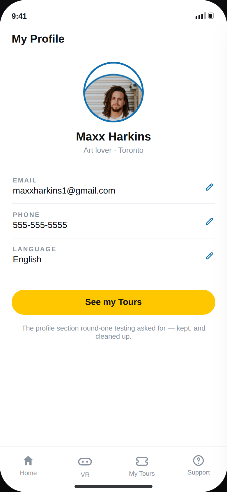
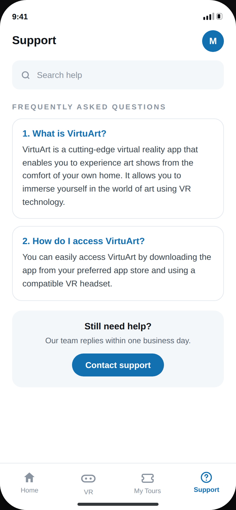
Digital wireframes became a lo-fi prototype. The first usability study asked for two things the design was missing: a profile section and FAQ support — both added.
Wireframes · Lo-fi prototype · Usability study 1
04
Build high-fidelity
The booking flow was kept visible and predictable — dates, times and confirmation states are clear — so users always know where they are and what happens next.
Hi-fi prototype · Mockups
05
Validate & iterate — round two
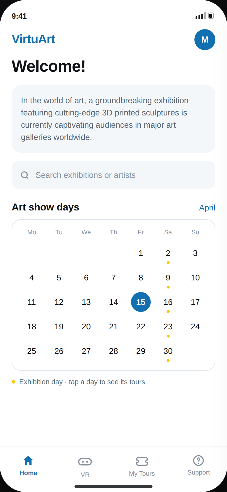
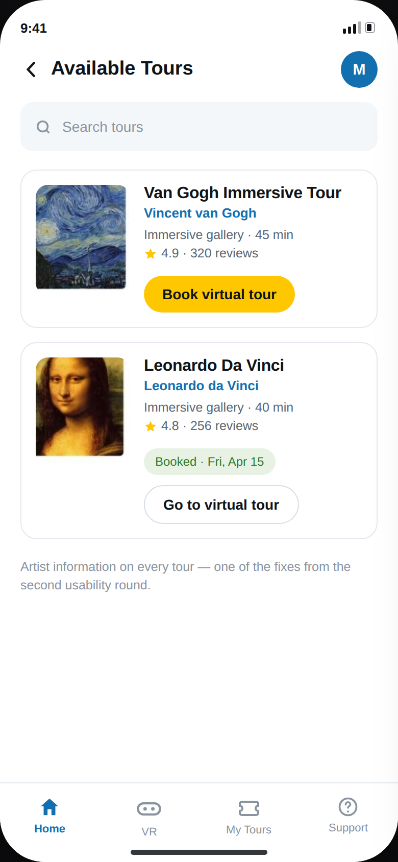
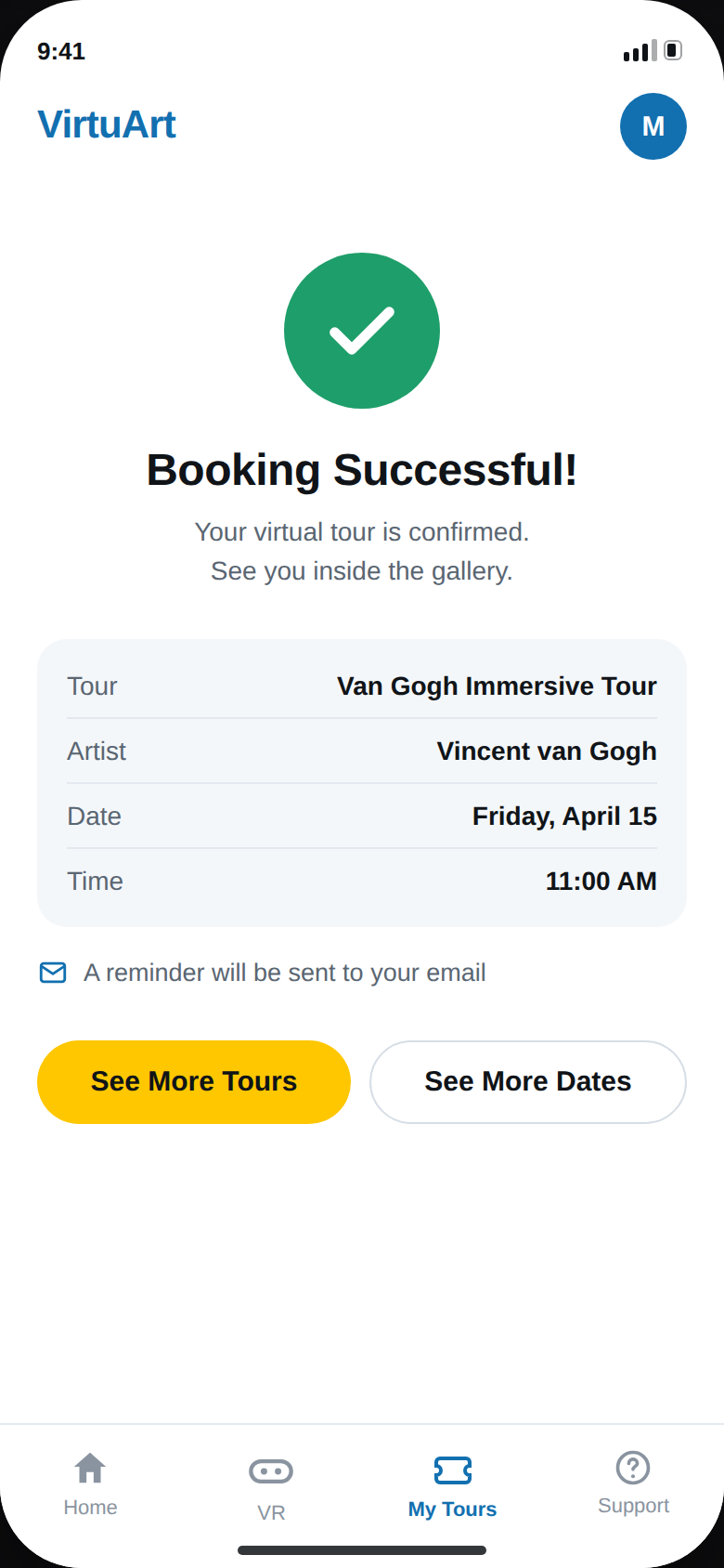
The second usability study, on the hi-fi prototype, found the calendar unclear, information about artists missing, and no visible success state. The final iteration clarified the calendar, added artist information and made completion obvious — and closed with an accessibility review.
Profile + FAQ added (R1)Calendar clarified (R2)Artist info added (R2)Success state (R2)
Process · My work · Result
The work, in images.
01 · Discover
Available tours
The core discovery touchpoint. Exhibitions as bookable tours — Van Gogh immersive, Da Vinci — one tap from browsing to booking.
02 · Experience
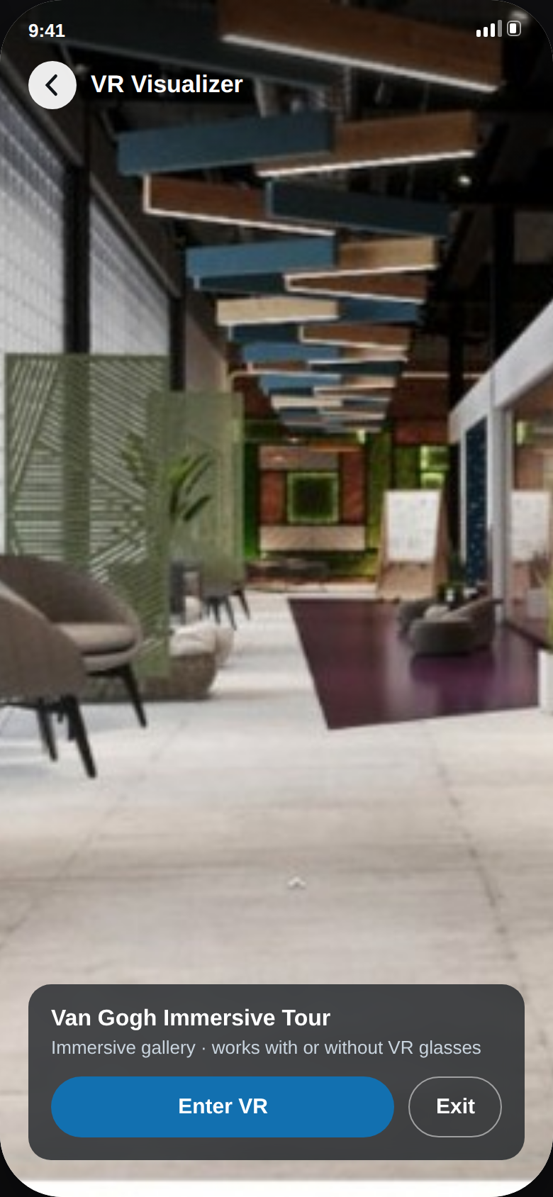
VR visualizer
Step inside. A full-screen immersive view of the exhibition — designed to work with or without VR glasses.
03 · Result
Booking successful
Completion, made obvious. Round-two testing asked for a visible success state — this is it, with the email reminder and the next tour one tap away.
2
usability rounds, lo-fi → hi-fi
5
steps: discover → repeat
3
revisions from participant feedback
Hi-fi
mobile prototype completed
VIRTUART · THE 2026 REDESIGN
Same app, three years of craft later.
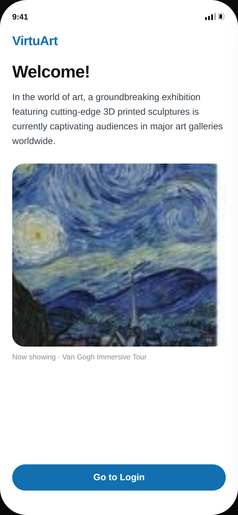
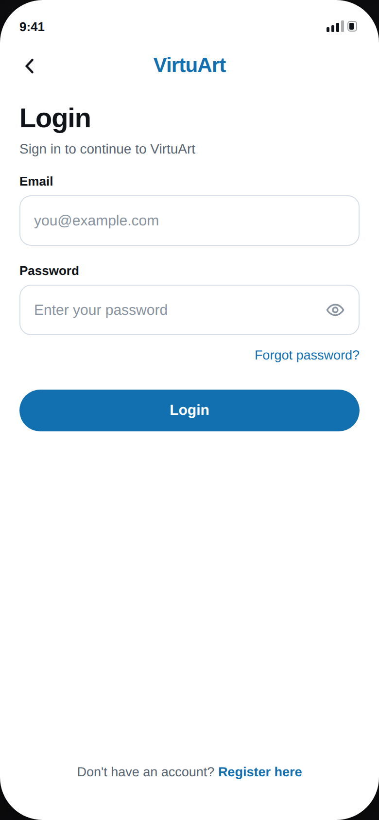
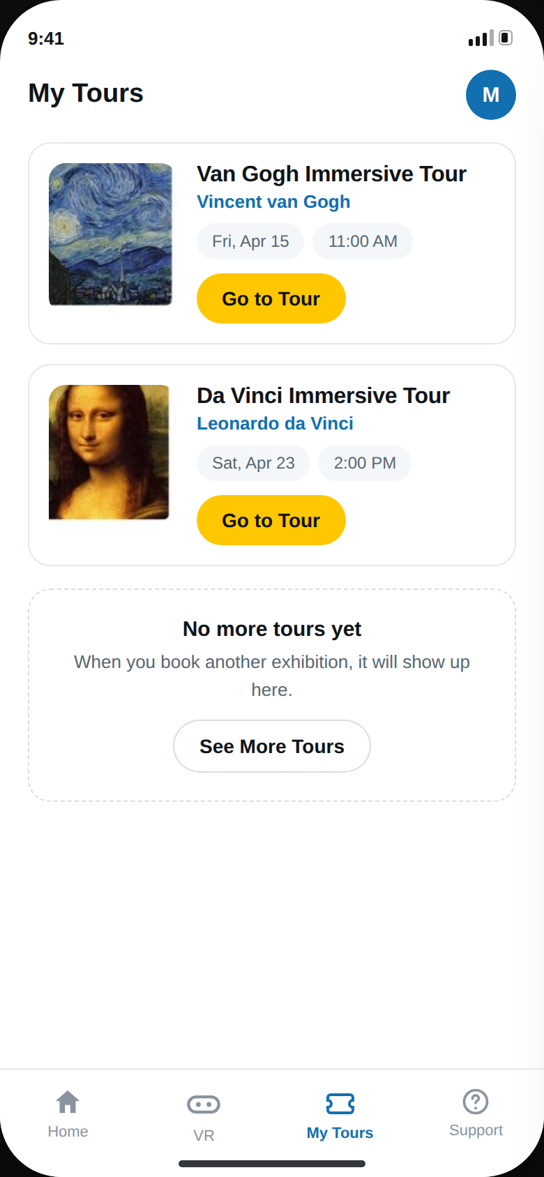
The original prototype was designed in 2023, while completing the Google UX Design Certificate. In 2026 the interface was rebuilt end to end — same identity (Inter, the VirtuArt blue and yellow), same flows — applying the findings of the two usability rounds: a legible calendar, artist information on every tour, and a booking confirmation that shows the full reservation. The 2023 screens above remain as the original deliverable.